History of the AAVSO Logo
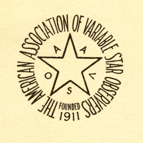
When William Tyler Olcott founded the AAVSO in October 1911, he also had appropriate stationery printed, which included the logo shown here, and which gave Olcott's title and home address: "Office of the Secretary, 62 Church Street, Norwich, Cnn., U.S.A." It seems fairly certain that Olcott himself designed the logo/seal at the time he decided to organize the AAVSO. This first logo also became the AAVSO's official seal that is still used today to emboss legal documents, official documents, and membership certificates.
 It was not until forty-three years later, in 1954, that the AAVSO came up with a new logo design. The change was symbolic, and in some ways necessary: that year, the AAVSO became a fully independent organization when it lost the financial support of Harvard University. The new design announced a break with the past as much as it declared the continuity and continued life of the organization. There were very good practical reasons for the redesign as well: the AAVSO was, in 1954, scrambling to apply for grants and philanthopic support in order to survive. The updated, modernized, and even "scientific" looking logo which began appearing on AAVSO letterhead in February 1954 was thought to be essential in showing the world that it was an up-to-date, serious, organization.
Note that the 1954 design echos the elements of Olcott's original design while at the same time gives those elements a modern and confident look. It is not known who made the design, but it could very well have been Newton Mayall, husband of Director Margaret Mayall. As a landscape architect, Newton would have had the "eye" and the drafting skill to come up with the new design, with the help and advice of Margaret, most likely, as well.
At the time of the AAVSO's 50th anniversary, some felt it necessary to reinvent the AAVSO's logo to celebrate that great event. Actually, the logo which came to be known as "the projected star" was designed for a set of AAVSO 50th anniversary costume jewelry first put up for sale in March 1961. The order form enthusiastically (but erroneously) says: "After 50 years the AAVSO has an official insignia!" Like its predecessors, this logo was designed anonymously. But here again, it's possible that Newton Mayall had something to do with it. The somewhat amateurish look of the "projected star" design did not have a very long life beyond the 1961 50th anniversary celebrations.

This color version of the 1954 logo was a logical extension: adding color was another way to announce an organization's modernity, and the AAVSO's new internet presence in the 1990s almost demanded that a color logo be displayed. Today both the black and white and the color versions of the 1954 logo are in use.
 Recently, the AAVSO's Citizen Sky project adopted a logo (right) that we feel is more in line with what we are looking for in a new logo. This logo was designed by Julieta Aguilera of the Adler Planetarium in Chicago.
The Centennial Year Logo Contest
In 2011, the AAVSO ran a contest asking for submissions for a new AAVSO logo. The jury received nine logo submissions, but decided to retain the current AAVSO logo. The top three submissions were awarded with one year's paid membership in the AAVSO for 2012. We would like to thank all who submitted entries.
*Michael Saladyga contributed to this page.


